Key takeaway
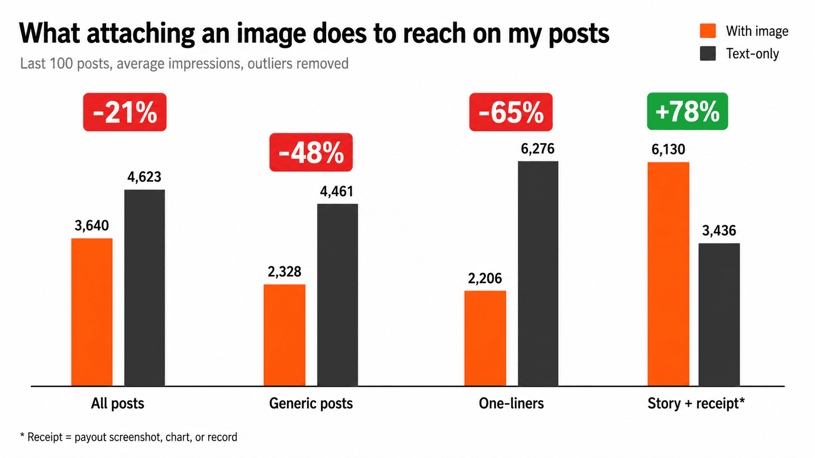
On my account, attaching an image cost 21% of a post's reach on average - and 48 to 65% on generic posts and one-liners, where the image is decoration. A large share of my decorative flops were AI-generated illustrations I added to underline the point; they did the opposite. The one exception: receipt images (payout screenshots, charts, records) on milestone posts, which beat text-only by 78% - and every one of those winners was a real screenshot, not AI. The divide is less image vs no image than real proof vs AI decoration. Image posts earned a higher engagement rate at the same time - X shows them to fewer people, but those people interact more - which is why studies that measure engagement instead of impressions keep getting this wrong. Attach an image only when the image is the evidence.
My reach was sliding. Median impressions per post dropped 44% in a week, and I wanted to know why. So I pulled the data on my last 100 posts, and one variable stood out immediately: whether the post had an image attached.
I had been attaching more images, on the theory that visuals stop the scroll. Last week 43% of my posts carried one, up from 39%. The data says that theory is half right, and the half that is wrong is expensive.
How I measured it
The setup: my last 100 posts, published over 13 days at roughly 8 posts a day, on an account of about 8,900 followers. Impressions come from X analytics, so this is real reach data, not likes-as-a-proxy. To keep the comparison honest I excluded posts published in the last 12 hours (metrics still accruing), excluded the two posts that contained external links (a separate, well-documented penalty), and used averages with outliers removed - anything beyond 1.5x the interquartile range got dropped, which removed a handful of viral posts that would otherwise dominate the averages. 43 posts had an image attached, 57 were text-only.
Do images reduce reach on X? My numbers
| Post type | With image | Text-only | Image impact |
|---|---|---|---|
| All posts | 3,640 | 4,623 | -21% |
| Generic posts | 2,328 | 4,461 | -48% |
| One-liners | 2,206 | 6,276 | -65% |
| Story + receipt image | 6,130 | 3,436 | +78% |
Average impressions, outliers removed. A receipt is an image that carries evidence: a payout screenshot, an analytics chart, a record. Generic is everything that is not a milestone or proof post.
Read the table bottom to top and the pattern is hard to miss. The thinner the post, the more the image costs. On a one-liner the image takes almost two-thirds of the reach. On a story built around evidence, the image nearly doubles it.
What my worst image posts have in common
The bottom of my feed for the window is a parade of decorative images. A "Very NICE!" with a picture: 2,055 impressions. "What animal are you these days?" with an illustration: 2,040. "Been loving GPT Image 2 lately, show me the coolest image you can make" with, naturally, an image: 985. Every one of these is a thin post where the image is decoration, not information. The text gave people nothing specific to react to, and the image did not add anything the text needed.
Do AI-generated images hurt reach on X?
This is the question my experiment really answers, because here is the part that stung: a large share of those flops were not lazy memes. They were fun, abstract AI-generated illustrations I made specifically to underline the post's point - I thought I was helping the post land. The data says the opposite. Readers have learned to scroll past generic AI art the way they scroll past stock photos, and an illustration of an idea carries no information the text did not already have. If you are currently pasting AI images under your posts to make them "pop", you are very likely paying the same tax I was.
Two honest nuances. First, the AI-image posts did not fail outright - they still reached 1,000 to 2,400 people. They just quietly did worse than the same post would have done as plain text, which is exactly why the tax is easy to miss. Second, a few AI-image posts genuinely popped - but those were the outliers, not the baseline, and you cannot build a posting strategy on outliers. The baseline is what the averages above measure.
Meanwhile the same weeks contained text-only one-liners like "Tell me one thing you can do that CLAUDE cannot do yet" at 15,460 impressions. Same account, same audience, same length band. The difference is that the text-only version travels as retweetable, quotable text, and the image version travels as a picture most people scroll past.
What my best image posts have in common
Now the other end. My top image posts in the window: the X payout screenshot showing $1,286.76 at 31,597 impressions. The screenshot of 1,010 replies in a single day at 14,634. The chart of ClimbX crossing $1,000 MRR at 7,969. A follower-growth chart on a milestone post at 6,411.
Every single one is a receipt. The post makes a claim with a real number in the text, and the image is the proof of that exact claim. The image is not decorating the post; it IS the post. That is the only image pattern in my data that consistently beats text-only, and it beats it by a wide margin: +78% on story posts.
Worth stating plainly, because it reframes the whole finding: none of the winning images were AI-generated. Every receipt was a real screenshot of a real number, while a large share of the losing images were AI illustrations. On my account the divide is not really "image vs no image" - it is real proof vs AI decoration. If your feed is full of AI-illustrated posts and your reach is sliding, this is the first experiment I would run.
The anatomy of the winning shape is consistent enough to write down. One: the number lives in the text ("X just paid me $1,286.76"), so the post works even for people who never open the image. Two: the image shows that exact number, so skeptics get their verification in one tap. Three: the text stays short - the receipt posts that won were all under 150 characters of actual writing. The image replaces explanation; it does not add to it.
Why do image posts get less reach but more engagement?
Here is the part that confuses almost every conversation about this. In my data, image posts had a 4.9% engagement rate against 3.4% for text-only. Images genuinely do stop the scroll: the people who see an image post interact with it more. But X distributes image posts to fewer people in the first place. Less reach, higher engagement per impression. Both things are true at once.
This is also why so much advice on the topic points the wrong way. Most public studies measure engagement rate, because that is what you can observe from outside an account. Impressions are only visible to the account owner. So the studies see the high engagement rate and conclude images work; the account owner sees the impressions graph and wonders where the reach went.
What do the large-scale studies say?
My sample is one account over 13 days, so it is worth checking against bigger datasets. Buffer's analysis of 45 million posts found that on X, plain text posts have the highest median engagement rate of any format: 3.56%, ahead of images at 3.40%, video at 2.96%, and links at 2.25%. X is the only major platform where text beats every visual format.
A second Buffer study of 18.8 million posts from 71,000 X accounts is even more direct about the distribution question: for non-Premium accounts, image posts ran at roughly half the engagement of text posts (about 0.20% vs 0.40%), and link posts collapsed to effectively zero after March 2025. That study's image-vs-text gap for regular accounts lands almost exactly on my -48% generic-post number, which is the kind of coincidence that makes me trust both datasets more.
A third, smaller dataset points the same direction. Adilo's engagement-rate analysis of 3,200 posts from creators, brands, and advertisers found text-only posts averaging 3.2% engagement against 2.09% for image posts - images trailing text by roughly a third, on a platform where everyone assumes visuals win. Three independent datasets, three different sample sizes, one direction: on X, the default post is text.
The link finding is its own topic - it is why ClimbX blocks links in scheduled posts entirely. But the mechanism appears to be the same: X's ranker favors content that keeps people on the platform and in the conversation. Text is quotable, replyable, and skimmable in-feed. A decorative image is a speed bump. A receipt image is a reason to stop.
When should you attach an image on X?
The decision collapses to three rules, and all three come straight out of the table above:
- 1Never decorate. If the image does not contain information the post needs, it is a reach tax of roughly half. Memes, vibe pictures, and above all AI-generated illustrations "underlining the point" fall in this bucket - an illustration of an idea adds nothing the text did not already say.
- 2Receipts are the exception. When the post makes a claim with a real number, attaching the proof outperforms text-only by a wide margin. Payout screenshots, analytics charts, records. Put the number in the text, the proof in the image.
- 3One-liners live on retweetable text. Short punchy posts are the strongest format in my data (posts under 80 characters averaged 5,591 impressions against 3,773 for longer ones), and they are also the format the image penalty hits hardest. Attach nothing.
The honest postmortem on my own habit: I added those AI images because they felt fun. But fun to the author is not value to the reader, and an element that adds no value is not neutral - it is noise. That is the through-line under all three rules, and it is not really about images at all: everything in a post either adds value or adds noise, and the distribution seems to price that in.
How to run this on your own account
One caveat before you rewrite your content strategy around my numbers: this is one account, one niche (builders and founders), one 13-day window. The direction matches the large-scale studies, but your audience may weight things differently - a design audience probably rewards visuals more than a founder audience does.
The test itself is simple to reproduce. Export your recent posts with impressions from X analytics, tag each one with image / no image and generic / proof, drop the outliers, and compare averages. Twenty minutes in a spreadsheet. If you post daily, 100 posts is only a few weeks of data, and the answer will almost certainly change what you attach to your next post.
ClimbX learns these patterns from your posts automatically.
This whole analysis - what formats work for your account, when an image helps, what your reach data actually says - is what ClimbX's learning loop runs continuously on your posting history. Its drafting agent grounds every suggestion in your own numbers, not generic best practices.
Read next
- How the X algorithm actually works in 2026. - Replies beat reposts beat likes. The 30-minute window decides everything. What the For You algorithm rewards now, and what it quietly suppresses.
- 81 days on X, 6,900 followers, and a first payout of $828.77. - The exact playbook behind 81 days of grinding X: 480 posts, 23,300 replies, 6M impressions, and a first monetized payout of $828.77. Plus why that payout was the least valuable thing it produced.
Sources
- Buffer: best content format on social platforms (45M+ posts) - text posts lead X at a 3.56% median engagement rate, ahead of images (3.40%), video (2.96%), and links (2.25%) - the only major platform where text wins
- Buffer: do links affect performance on X? (18.8M posts, 71k accounts) - for non-Premium accounts image posts run at roughly half the engagement of text (~0.20% vs ~0.40%), and link posts fell to effectively zero distribution after March 2025
- Adilo: X engagement rate chart by post type (3,200 posts) - independent dataset showing text-only posts at 3.2% average engagement vs 2.09% for image posts - the same text-over-image direction from a third source